
 Quinn Kessler
Universal Marble & Granite
A kitchen and bath showroom on Lehigh Ave sells in person. The website’s job is to get homeowners and contractors to call, visit, or ask for a quote. I designed and built it, made it findable, and kept it stocked with content for six months.
- Role
- Digital Marketing Specialist Co-op
- Timeline
- March – September 2026
- Scope
- Design, front-end build, SEO, analytics, social
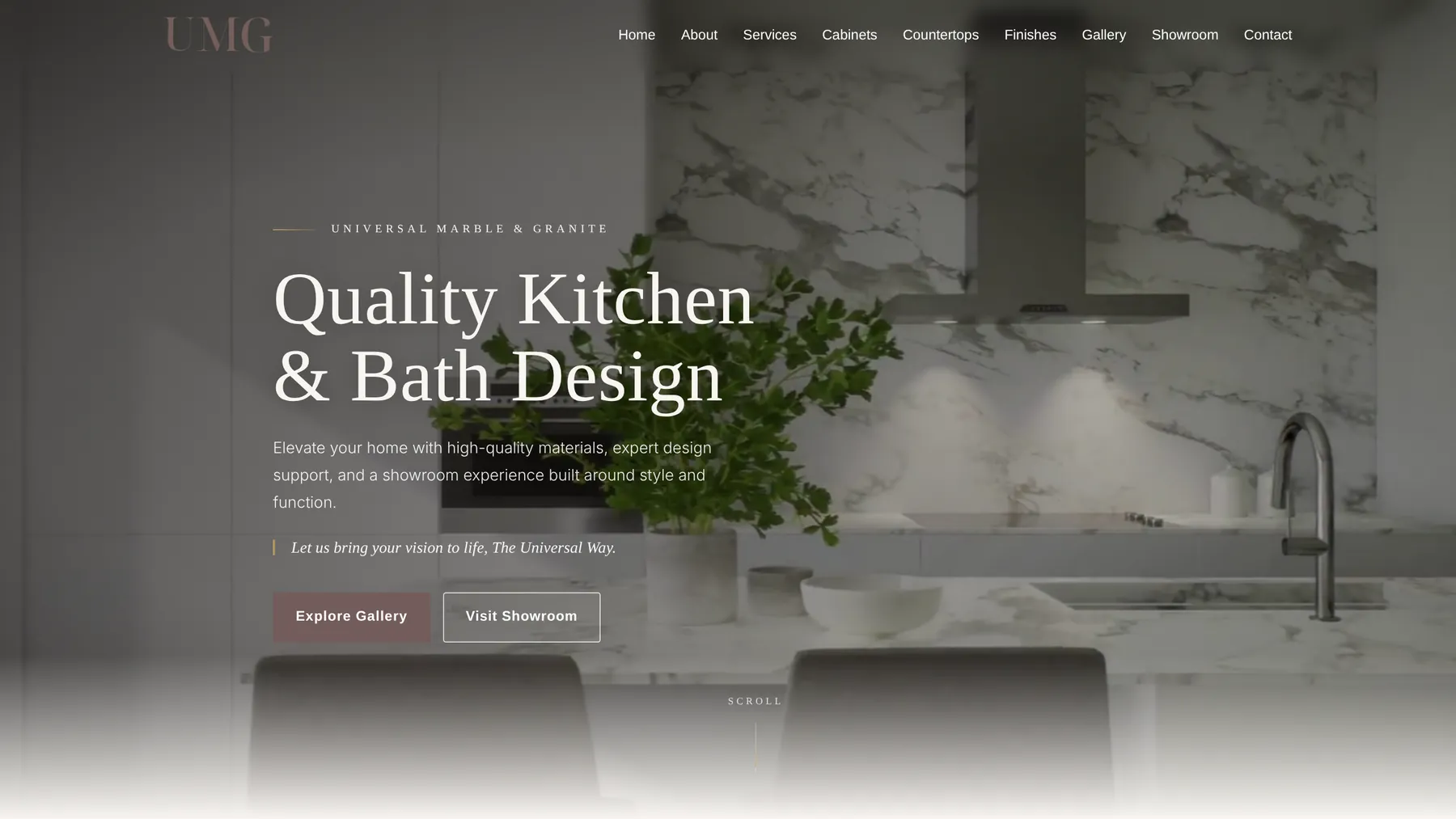
01 · The site
A showroom you can browse from the couch
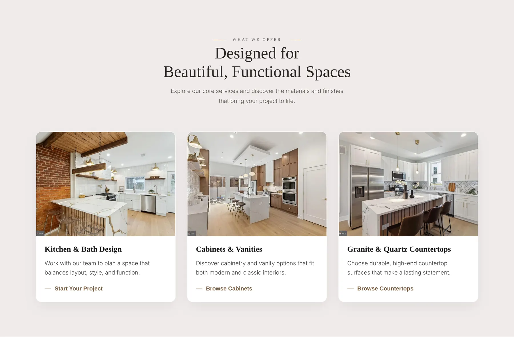
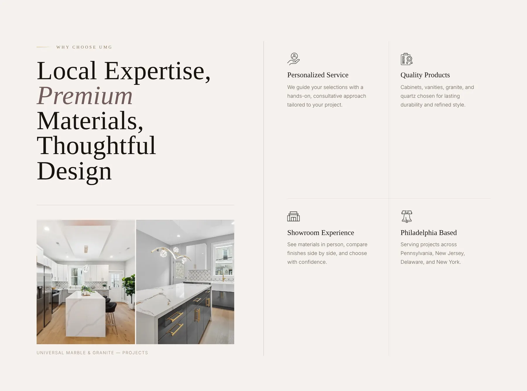
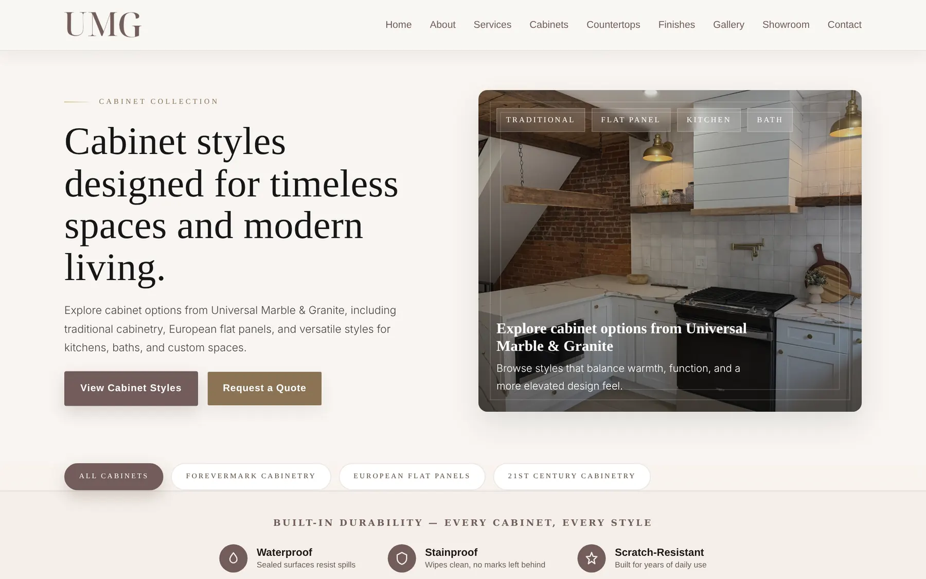
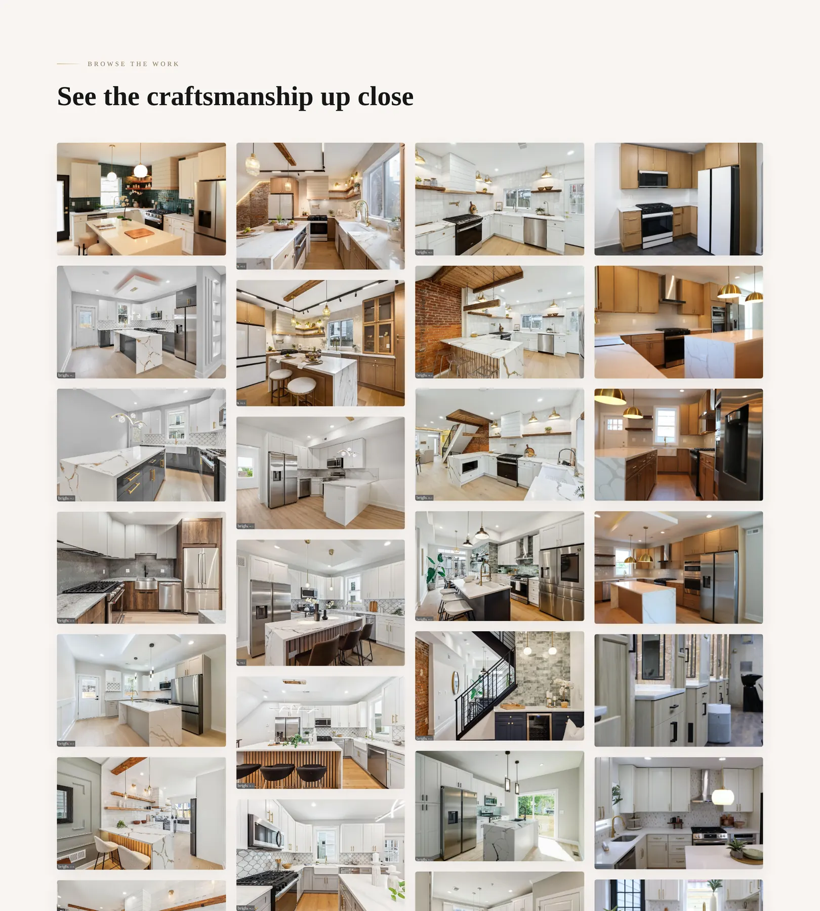
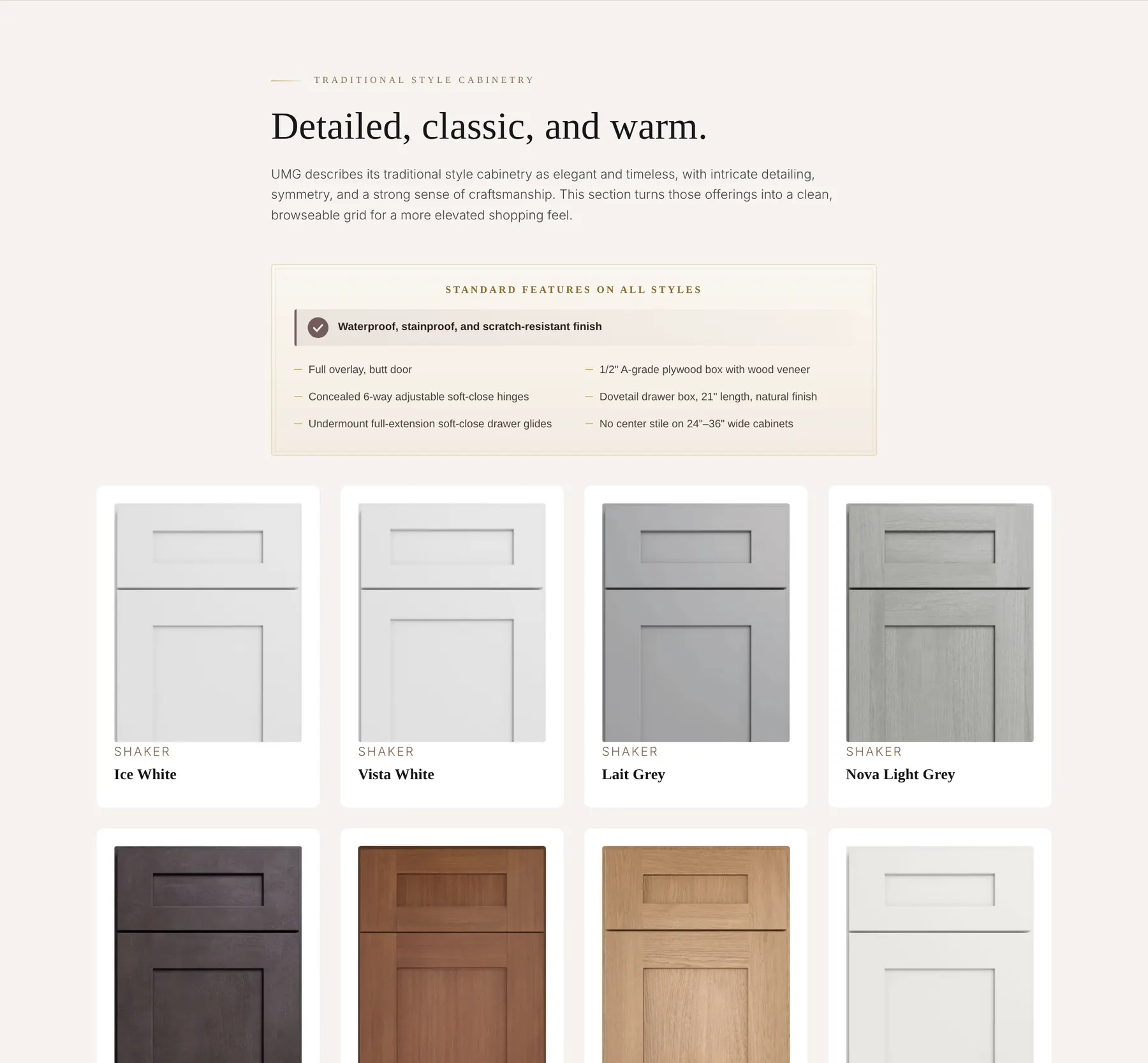
UMG serves homeowners in the middle of a renovation, and the contractors and developers working on their projects. They want to see finished kitchens, compare materials, and know where to go next. So the site is built around three things: real project photos, catalogs that are easy to scan, and a phone number that is never more than a scroll away.
The visual language borrows from the showroom itself: warm stone neutrals, a deep brown for contrast, serif headlines for a premium feel, and generous photography.
02 · Interaction
Show the slab, not just its name
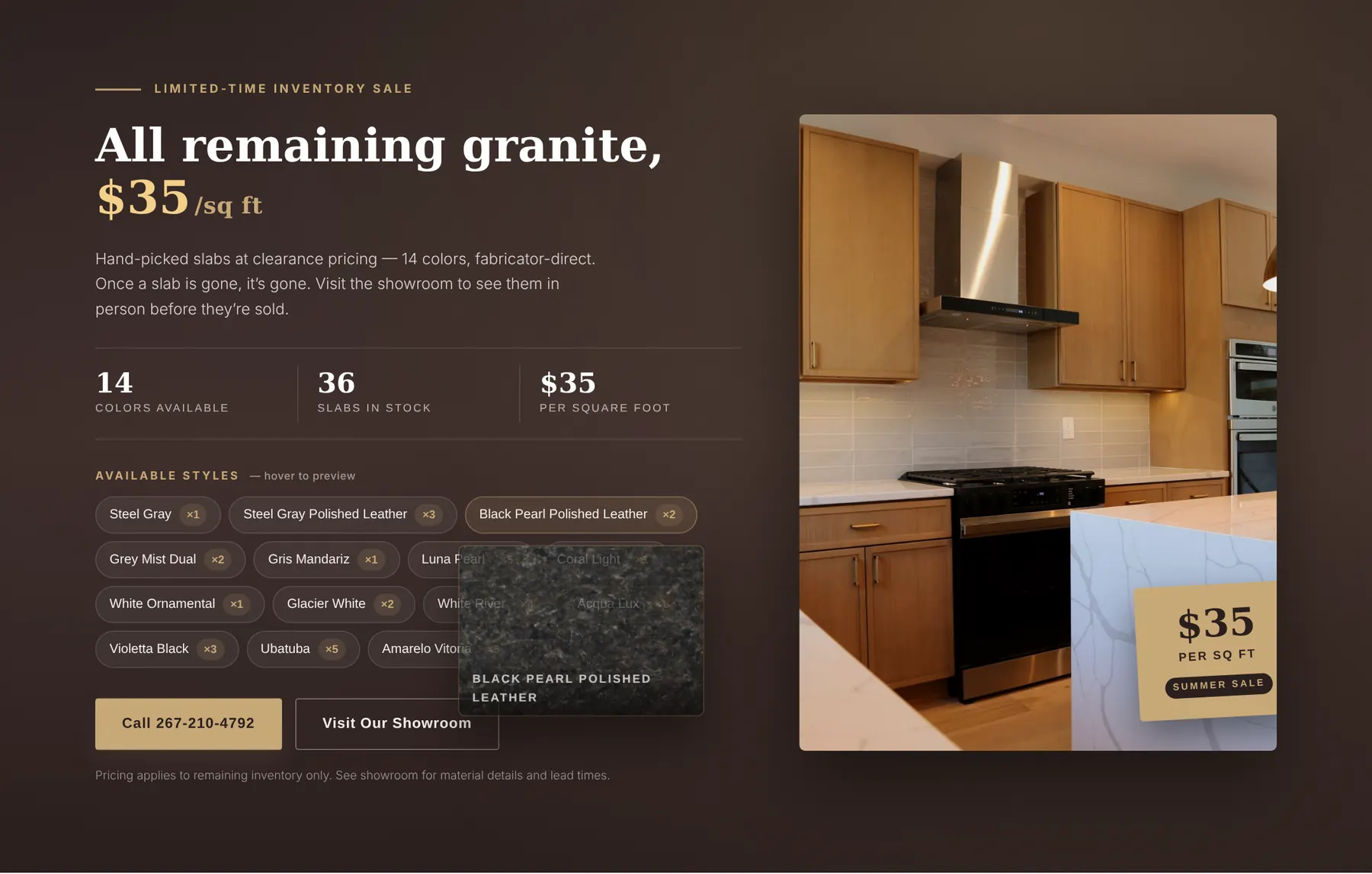
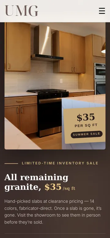
For the summer granite sale, a list of names like “Gris Mandariz” meant nothing to most visitors. I turned each style into a chip with a slab count, and hovering, focusing or tapping one previews the stone. Below is a working rebuild using the same photos and counts.
All remaining granite, $35/sq ft

Try it: hover or tab through the styles. On the live site the preview floats under the chip on desktop and opens inline on phones.
03 · Mobile
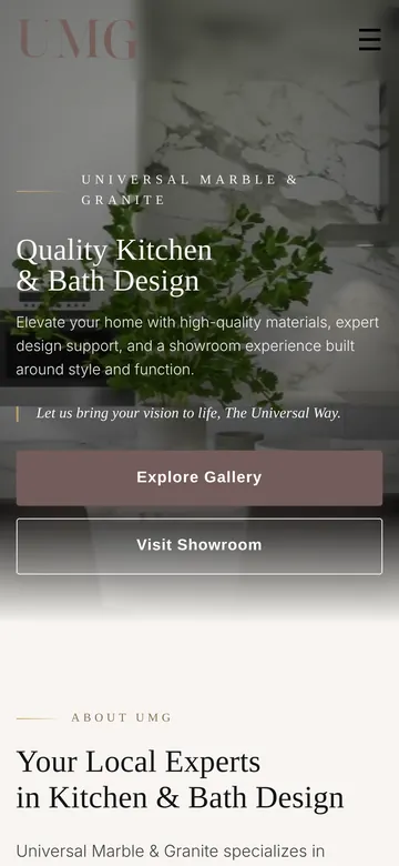
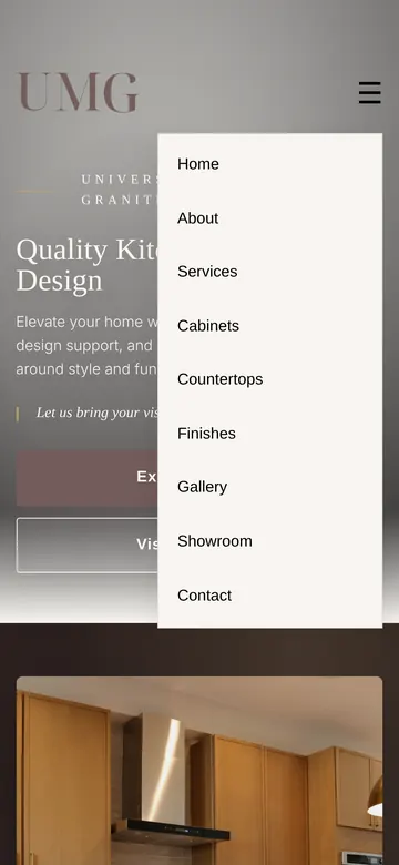
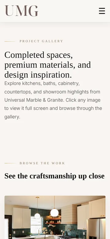
A lot of UMG’s audience finds it through Instagram, so the site had to work just as well on a phone. Navigation collapses into a menu, sections stack, and the call button stays large enough to hit with a thumb.
04 · Under the hood
Making it findable
A good-looking site still has to show up when someone near Philadelphia searches “granite countertops.” This is the code that does that work. Every snippet below is from the live site.
Every page has its own title and description written around what people actually type into Google: the service, then the place. A canonical URL keeps duplicates out of the index.
<title>Universal Marble & Granite | Kitchen & Bath Design in Philadelphia</title>
<meta name="description" content="Philadelphia showroom for kitchens, bathrooms, cabinets, vanities, and granite and quartz countertops. Personalized design support from Universal Marble & Granite.">
<link rel="canonical" href="https://www.phillyumg.com/">
When someone shares a UMG link over text or Instagram, Open Graph and Twitter Card tags make it preview with a branded image and a real headline instead of a bare URL.
<meta property="og:type" content="website">
<meta property="og:title" content="Universal Marble & Granite | Kitchen & Bath Design in Philadelphia">
<meta property="og:image" content="https://www.phillyumg.com/images/metatag.jpg">
<meta property="og:url" content="https://www.phillyumg.com/">
<meta name="twitter:card" content="summary_large_image">
JSON-LD tells search engines UMG is a local business with an address, hours and a catalog of services, which is what feeds map listings and rich results.
{
  "@context": "https://schema.org",
  "@type": "HomeAndConstructionBusiness",
  "name": "Universal Marble & Granite",
  "address": {
    "@type": "PostalAddress",
    "streetAddress": "233 W Lehigh Ave",
    "addressLocality": "Philadelphia",
    "addressRegion": "PA",
    "postalCode": "19133"
  },
  "openingHoursSpecification": [
    { "dayOfWeek": ["Monday","Tuesday","Wednesday","Thursday","Friday"],
      "opens": "08:00", "closes": "17:00" },
    { "dayOfWeek": "Saturday", "opens": "09:00", "closes": "15:00" }
  ],
  "hasOfferCatalog": { "@type": "OfferCatalog", "name": "Services", "itemListElement": [
    "Kitchen Cabinets", "Bathroom Vanities", "Granite Countertops",
    "Quartz Countertops", "Marble Countertops" ] }
}
A sitemap with the image extension lists every page and its hero photo, and robots.txt points crawlers to it.
<url>
<loc>https://www.phillyumg.com/</loc>
<changefreq>monthly</changefreq>
<priority>1.0</priority>
<image:image>
<image:loc>https://www.phillyumg.com/images/outfront_1.jpg</image:loc>
<image:title>Universal Marble & Granite showroom in Philadelphia</image:title>
</image:image>
</url>
# robots.txt
User-agent: *
Allow: /
Sitemap: https://www.phillyumg.com/sitemap.xmlDeployed on Vercel straight from GitHub: every push to main goes live in about a minute. Clean URLs drop the .html, images and stylesheets cache for a year, and a few security headers come on every response.
{
  "cleanUrls": true,
  "headers": [
    { "source": "/(.*)", "headers": [
      { "key": "X-Content-Type-Options", "value": "nosniff" },
      { "key": "Referrer-Policy", "value": "strict-origin-when-cross-origin" },
      { "key": "Permissions-Policy", "value": "camera=(), microphone=(), geolocation=()" } ] },
    { "source": "/(.*)\\.(jpg|jpeg|png|gif|webp|svg|ico|woff|woff2)", "headers": [
      { "key": "Cache-Control", "value": "public, max-age=31536000, immutable" } ] }
  ]
}06 · Showroom mural
The brand, off the screen
I also designed and hand-painted a UMG mural above the doorway in the showroom. Each letter is cut from black-and-white Philadelphia imagery, with the Liberty Bell in the G.
07 · Takeaways
Owning a real business’s site end to end, with real customers on the other side of it, taught me four things.
Design for the actual visitor. People shopping for a kitchen want to see finished kitchens. That decided the photo-first layout more than any style preference did.
The invisible work matters. Meta tags, structured data and a sitemap don’t show up in a screenshot, but they are a big part of whether a local business gets found.
Consistency compounds. Keeping the site, the feed, the Stories and the mailer in one visual system meant every piece pointed back to the same brand.
Small interactions sell. The swatch preview is a few lines of JavaScript, and it turned a list of stone names into something people could actually choose from.
05 · Social
Feeding the site every month
The website was one channel. The rest of the job was giving people a reason to visit it: monthly content calendars, carousels, Stories, Reels and print, all in the same warm, editorial voice as the site.
Shaker Collection · 12 slidesCabinet carousel: one door style per slide, each named on a full-bleed kitchen photo so a scroller can save the one they like.
Who We Are · 6 slidesAn intro carousel that answers the questions a new follower has, in order: who UMG is, what they do, where they are, when to come in, and how to start.
Kitchen Inspo · 5 slidesA style guide carousel (cozy, modern, clean) that ends on a call to visit the showroom.
Petit Collection · 6 StoriesThe same cabinet system adapted to 9:16 Stories for the Petit line.
Swipe, use the arrows, or focus a carousel and press the arrow keys.
Reels
Scripted and produced for Instagram. Tap to play with sound.
Campaigns
Every promotion went out as a set: a feed post, a Story and a matching graphic.
Print & merch
A direct-mail postcard for homeowners and crew shirts, built from the same type and color as the site.